Creating a Chart
Use the Chart content type to present simple statistical data graphically without having to create the charts manually.
Accessing H5P in Canvas

Clicking on that menu item will open a pop-up showing your H5P library. From here, you will have the option to either insert previously created content or create something new.

The Chart editor should now appear. The editor looks like this:
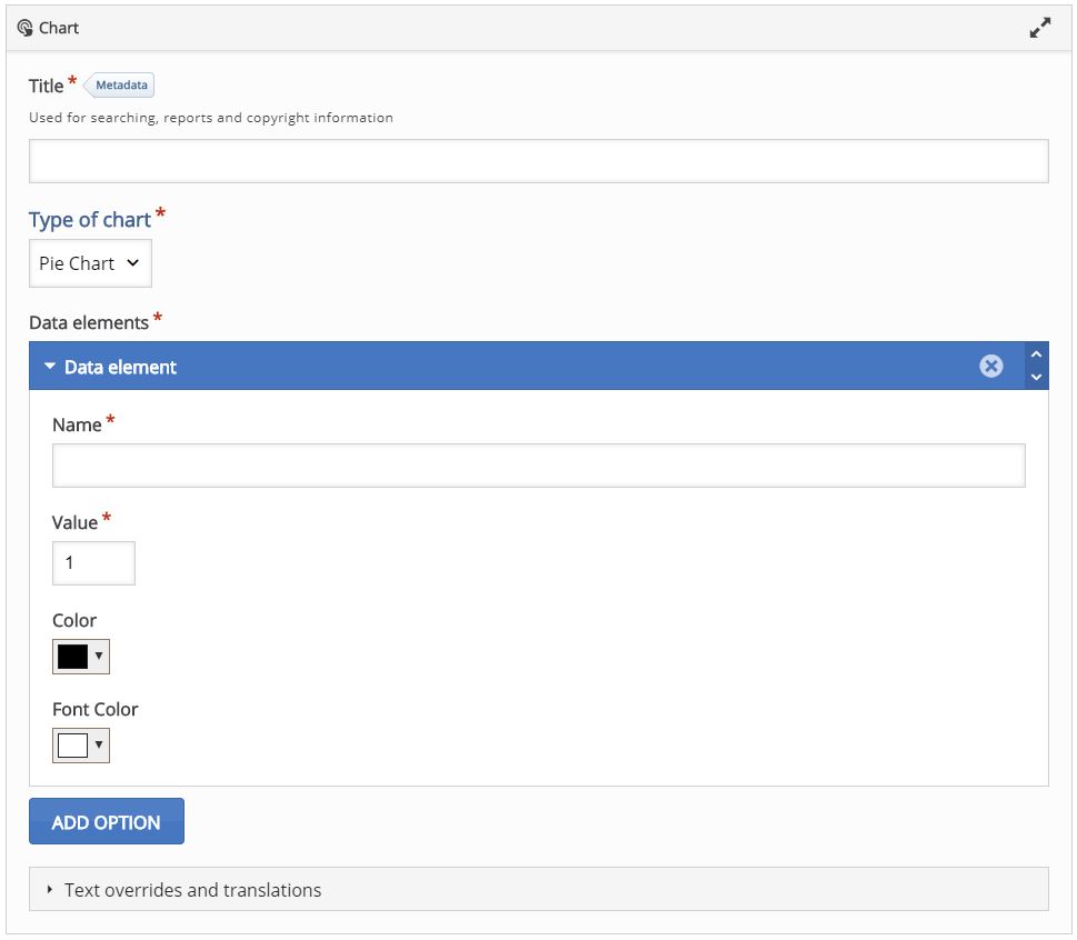
Creating Content
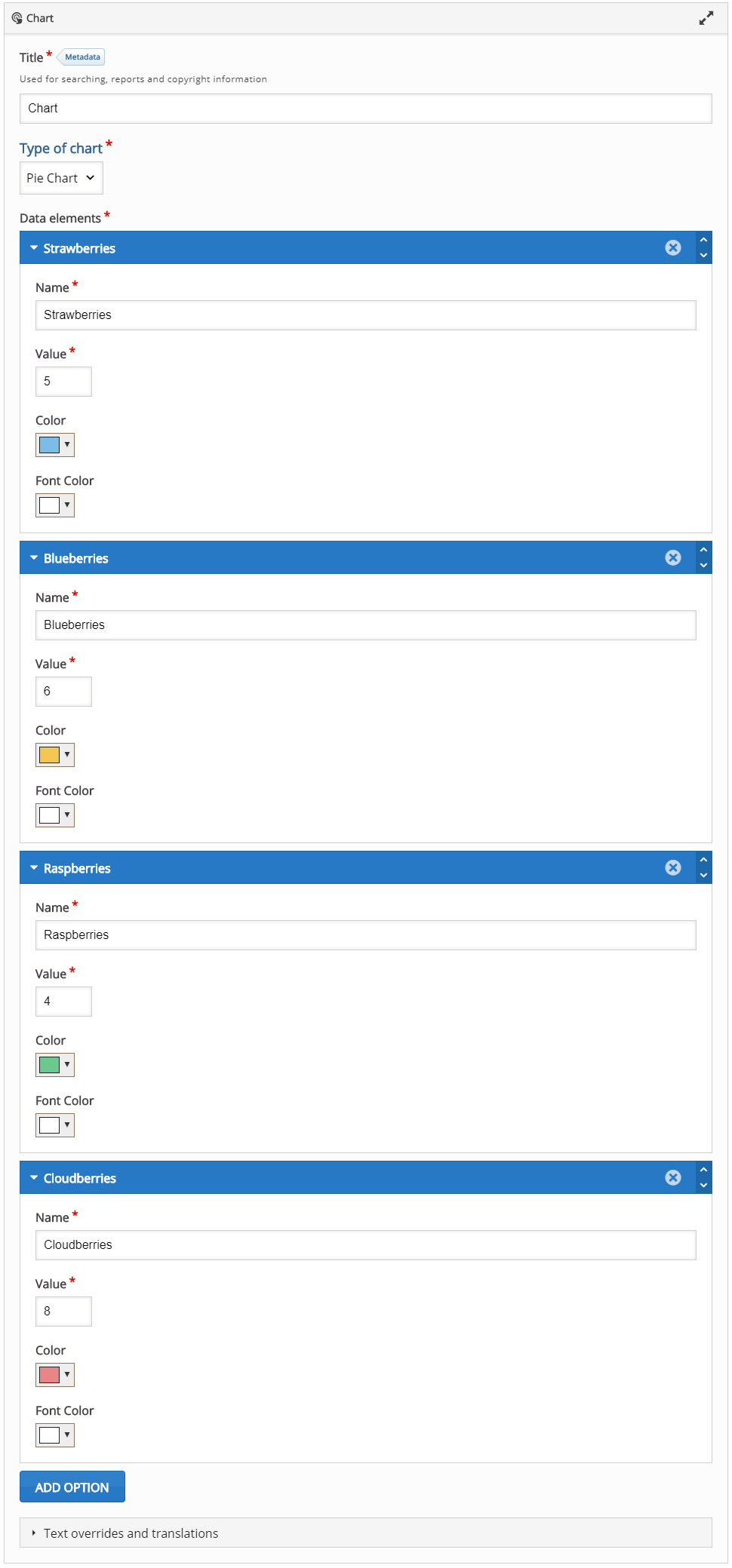
Fill in a Title and for Type of chart select "Pie Chart".
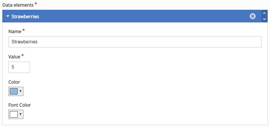
Under "Data elements" add content for example:
- Name: Strawberries
- Value: 5
- Color: Blue
- Font Color: White
Your 1st data element should look like this:
To add the next "Data element" use the big blue "Add option" button.
Add 3 more items and fill them in with the content. You can set any background/text color you like. When you are done, you should get the editor looking like this:
The pie chart will something like this

At any point, you can switch your chart type, just select down arrow at the Type of Chart feature at the top of the Chart editor and pick Bar Chart. Your content will now be displayed as a Bar chart and it should look like this:

Finishing up
Save and Insert to view your finished Chart.